This is How Your Company Website Should Look Like in 2017

Born of experimentation and innovation, trends are well-known changes that happen in all creative fields, which for the most part, push an industry to move forward.
Trends are born to change and prosper by time. The year 2016, more like the last several years, featured an ongoing debate about web design industry. With the start of the New Year, it’s time to look at the future of the website designs.
With the advancement in technology, users are expecting or would say demanding more and more from their online user experiences (UX). Keeping that in mind, web designers have to produce an interactive, personalized and relevant user experience. The traditional web design was to make the tech look good to its audience. But web design is more than that. Websites are no longer made just to look beautiful, rather they need to look into the experience of users and their stories.
So the million dollar question is, what are the top hottest website trends in 2017 or how can someone make their company’s website unique from the last year. We are sharing here some fast emerging website design trends which will propel your website to the top in user experience.
Let’s get started!
Mobile-First Approach!
In this era, we are looking for everything at our fingertips. I mean literally, we just have to scroll down and to find anything. To sum up the things, the mobile-first design has become the first approach to make your websites mobile friendly.
The trend is not new to the last year and has been here for a few years now. Mobile phones are becoming the primary devices to browse the web and realizing this important trend, more companies, designers, and developers are trying to deliver content on a small screen effectively.
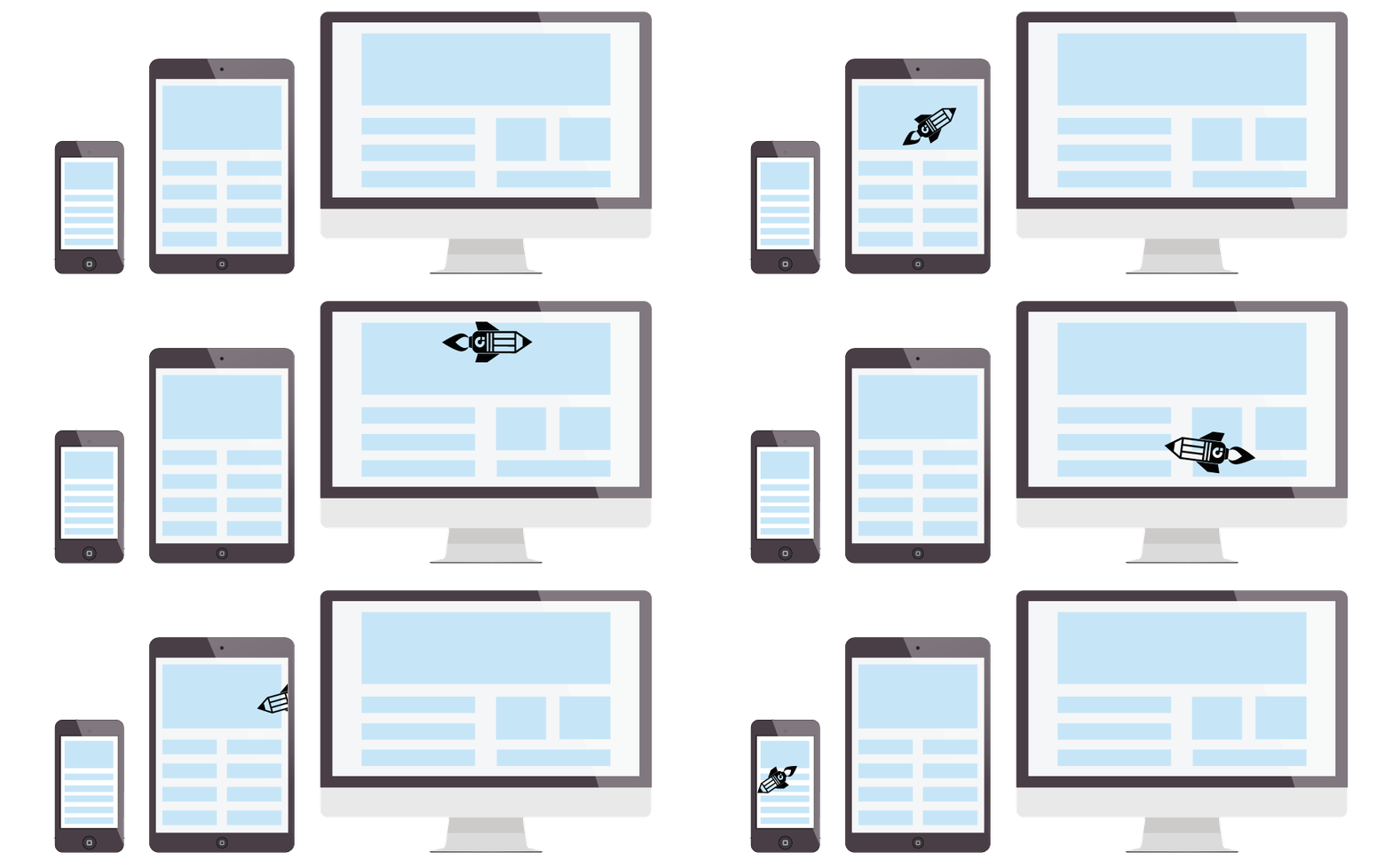
The content should first designed to fit on small screens then one can work up towards the large-screened devices. Mobile phone and smartphones have smaller screens which limits the amount of content a user can easily view at once.
Our prediction is, since mobile-first isn’t a new concept in 2016, we foresee more sites in the new year to deliver content to the smaller screen with a more thoughtful approach.
Draw Attention with GIFS & Other Animations!
Ignoring gifs and other animations can definitely hurt your user experiences (UX).
GIFS are going mainstream. They’re everywhere. Using them in the right way can bring your website to life. GIFS & animations give a sophisticated touch to the website. Use them on a specific element to make them stand out. Or even add some depth to your website with parallax effect. You can even add a 3D effect that will tell your overall website story in a fascinating way.
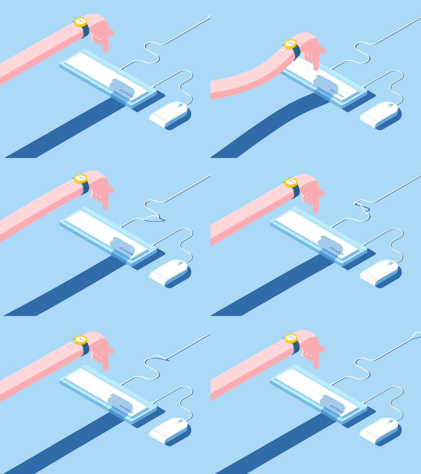
Don’t overuse them. GIFS are great to draw users’ attention. GIFS provides rich product experience, explains the workflow or more simply can provide a guide for your users on your website.
Think Outside the Box with 3D Shapes!
The animation is playing a key role in our digital interfaces. A few years back, skeuomorphism was the big digital trend. The idea behind was to imitate real life objects on digital interfaces, but it didn’t feel modern enough. Then, the flat design took over the web with strong color blocks and has no reference to our actual world. Finally, Google, comes up with the idea of Material Design with a fresh perspective to the geometric shapes, adding shadows, motion and boldness to the geometric style.

When Google flaps its wing, the entire web industry is shaken. And if they are using geometric shapes, we should too. With more visual tools, designers can build engaging and smile sparkling animations. So be ready to see more and more 3D geometric shapes in website backgrounds.
Big, Bold, Flashy Typography
Typography is another powerful visual medium. As device resolution are becoming sharper, brands are producing the type of typography to appeal to their users.
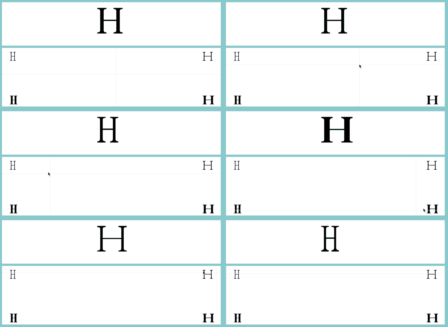
Typography rules were very strict before but not anymore. It is expected to see an increase in over-sized and full-screen type which breaks the grid, beautiful, unique, hand-rendered typography and lots of dynamic text and image layering working in tandem with parallax scrolling.
The trend is not stopping anytime. Brands are going bigger and more eye-catching, with dynamic colors, textures, and vibrant fonts to create an overall “wow” effect on your website.
Minimalistic Web Design
Basically, people now want de-cluttered, simple and visually explanatory websites. Minimalistic web design is taking the trend to a whole new level in 2017.
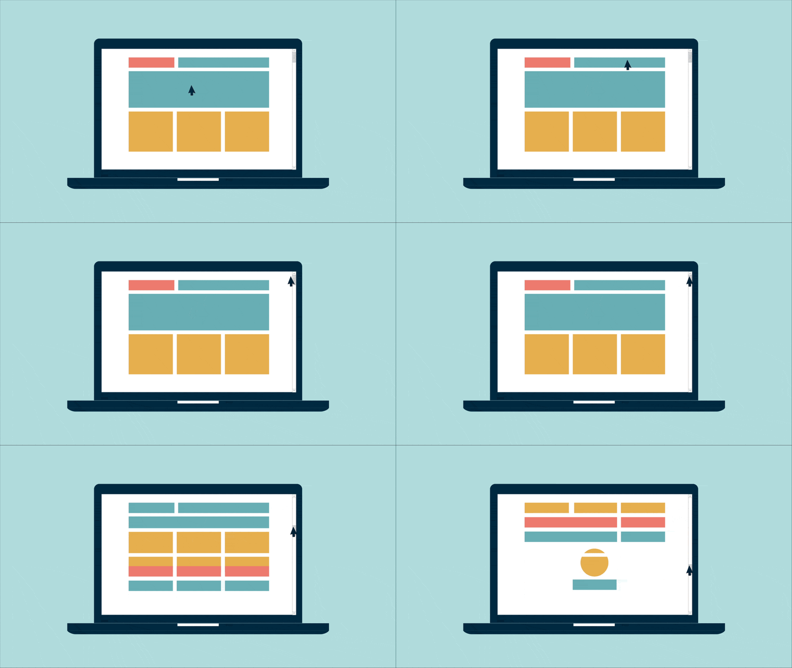
Instead of the home page, users are now hit with a card. The “cards” are entry point which acts as a doorway to the information. Within a website, multiple cards can be used to visually suggests a topic and entice users to click. The website using cards are doing a great success like Netflix. The images displayed, are explaining more about the particular thing of your website and using less space. This design can also go for menus and navigation.
Microinteractions
Microinteractions are those tiny details which are a good way for users to interact with a website or a mobile app. Those tiny details typically include communicating feedback, manipulate a setting, prevent user error.
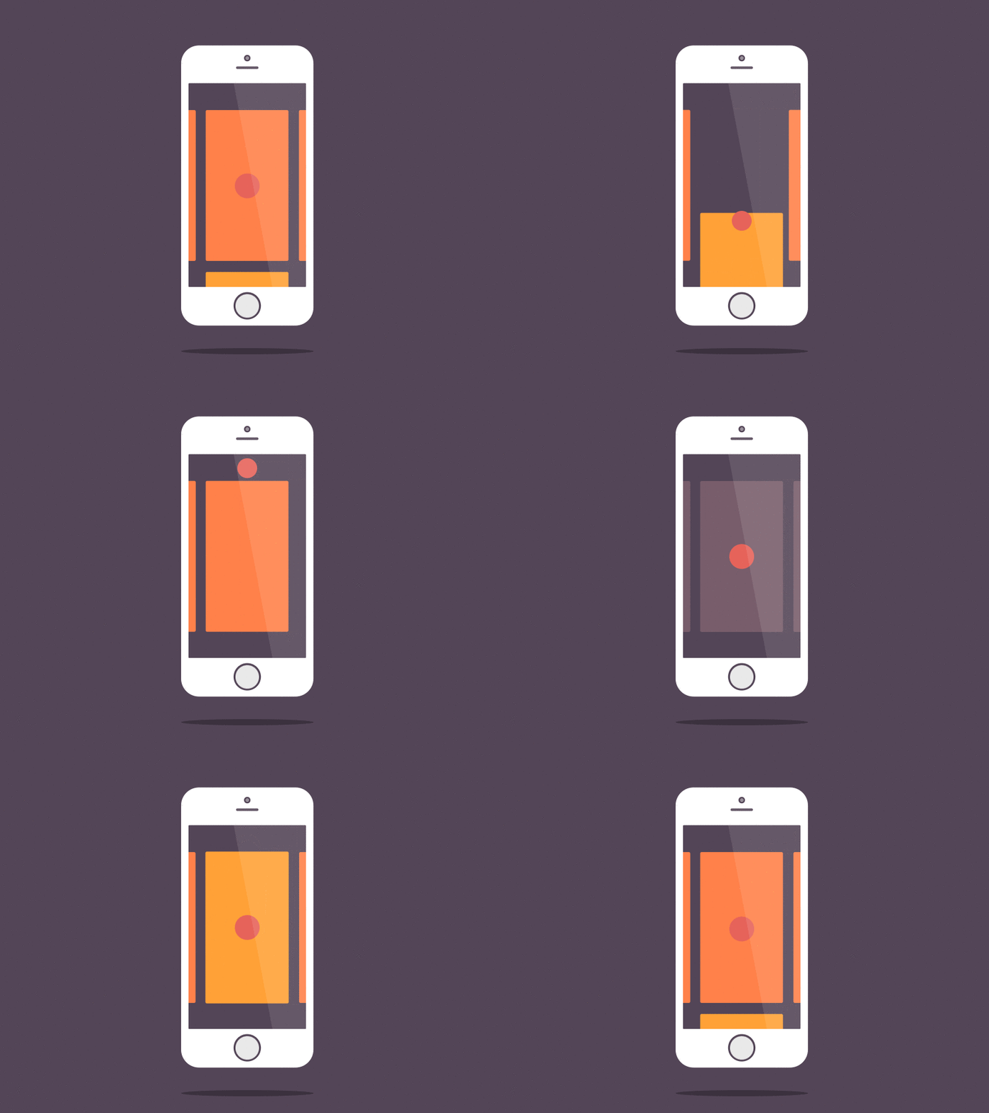
A well-designed micro interaction has a powerful impact on users. Like adjusting the volume of a music player, turning off or on to any feature and much more. Every touch, pinch, scroll, tap, zoom and click is getting richer with more animations and interactive elements.
Wrapping it up!
Here’s a bonus tip, a cool and a fashionable tip is to customize your website map in a way that complements the design of your website.
There are 100+ other trends going in the web industry and it’s hard to pinpoint every single one. But we believe that above are some of the more core ones. Not all these trends may be relevant to your company website, but it’s always beneficial to know what’s happening around you and how you can make your company’s website unique in order to develop and progress.
Latest posts by Moiz Khan (see all)
- How to Use AI to Enhance your SEO Strategies? - August 31, 2023
- What You Need to Know About Test Automation in DevOps - August 30, 2023
- 6 Cloud Computing Challenges That Businesses Need to Be Aware of - August 22, 2023

 Careers


Pingback: The Top eCommerce Trends You Should Look out in 2017()