Most Engaging Website Design Inspirations 2019

Your first impression is crucial for your business. And nobody gets the second chance to make the first impression — that’s the reason why your homepage is inevitably one of your website’s most vital pages. The greatest design influence you to take action. Throughout the day you were clicking and scrolling, and then you stopped. It might be an amusing interaction, a stunning picture, or just something you have never seen before. You just get hooked.
Your website can serve new and potential customers as an online gallery of your product and service offerings. An amusing website experience can take your businesses to a completely different level. In this article,
we’re going to show you some of the best websites with the most amazing designs so you take inspiration for your business website and may be give a redesign to your website.
Here are some of the best website designs to look up to in 2019.
Apple
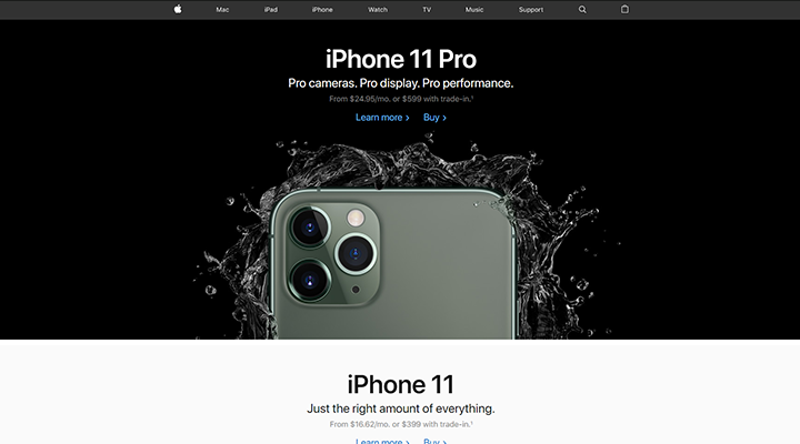
While talking about the list of brilliant websites, Apple can’t go missed. And the innovative giants have gone big this year.
To promote their products, they have taken hyper-realistic, sensational image taken from unique angles. The website is inviting, stylish, simple and tidy, making it possible for the brand to show off its products and make them the central focus. In fact, this is their website’s main purpose- selling and advertising their products.
The design of their website has quite an efficient use of white space to ensure that as a customer, the product on the picture slider catches your eyes. The homepage is fairly brief, especially if you miss the footer, which will stop people from needing to scroll to find what they are looking for. Most of us are not able to compete with this. But selling ‘ high-quality product images ‘ is and has always been the same fundamental precept. So put the effort in your pictures and think from buyer’s perspective.
Airbnb
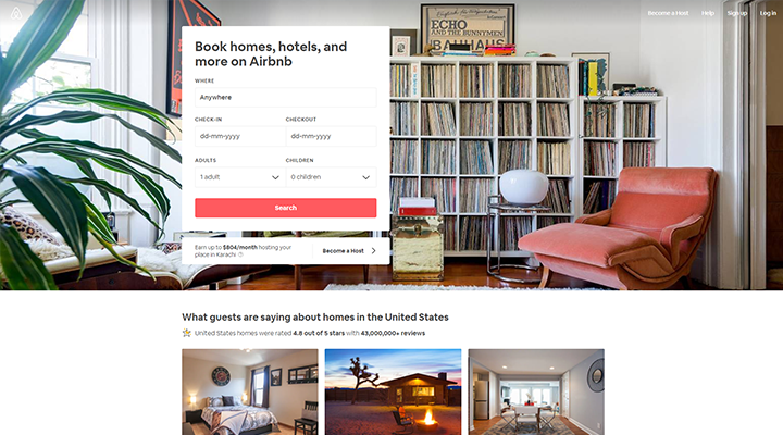
Airbnb offers the search form for the destination and date that most travelers are searching for, right on front, to direct visitors to the next logical step. The search type is “smart,” which means that if they are logging in, it will auto-fill the last request of the user. The primary call-to-action contrasts with and stands out from the background; but the secondary CTA provided for hosts is also visible above the fold.
It presents recommendations for excursions and getaways that Airbnb users can book on the very same site as their lodging to make visitors more excited to book their trip on the site. Moreover, it suggests which of these deals are most demanding and famous among other users.
Dropbox
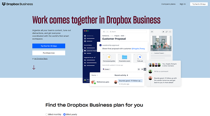
Dropbox is a great example of all-around successful marketing. The homepage of the company is no different. You have a subtly askew hero picture that attracts the eye and two CTAs — including one that uses a dark background to draw more attention as it is for the tool’s paid version.
The home page and website for Dropbox is the quintessential example of elegance. It restricts its use of copy and visuals and includes white space. There’s a very straightforward marketing copy. Dropbox knows and understands the target audience and practice drills down on points of pain that directly affects them, including security and efficiency. Also, the navigation is pretty stripped down, with “Compare plans” choice.
Seriously Unsweetened
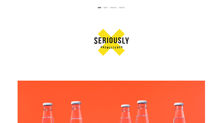
Less is more in the case of web design. A cliché, but it is one of 2019’s most effective design trends. This brand of sparkling water has developed a site that is seriously minimalist but thought-provoking.
It shows bold colors behind clear bottles, with a visual flow below that is easily scannable. It also features the entire X-shaped logo, emphasizing the essential brand recognition throughout the website.
You make it easier for your customers by avoiding complicated interface models. The page loads faster, lowering the bounce rate and focusing on the motive of your brand.
Seriously Unsweetened have used white space with simple but contrasting color schemes, focusing on minor details, such as variations in the logo, and using headers that clearly define each page.
Lemonade
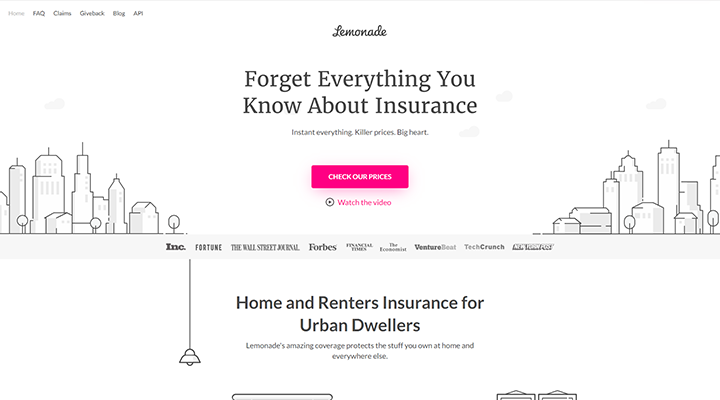
This is a website that raises the bar. It provides insurance quotes in just five minutes using CUI (Conversational User Interface) integration.
Lemonade is also an excellent example of a one-page website that is engaging and attractive. Spread with some well-placed action buttons such as ‘Get Prices and Switch’ which is incredibly easy to navigate. Ending with Maya which is a chatbot who interacts with you on a human level. She’s got a face! Owing to its user interaction, this type of web design is really useful, and it evokes credibility. The transitions are also smooth, with answer forms prominently displayed.
Writing the chatbot script in small segments is a simple tip, predicting every possible answer to queries. Also, teach them the most common misspellings for people. And while chatbots are not a new concept, they are thought to be the future interface.
Medium
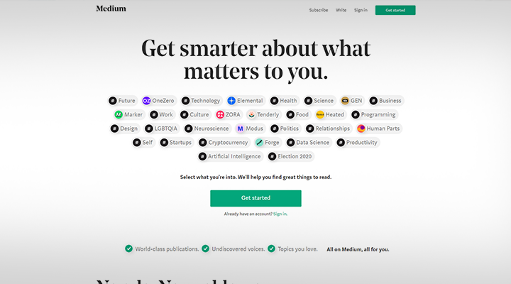
It is among the best examples of whitespace uses. This helps make the tagline and picture of Medium’s app become prominent while still drawing the attention to the darker section titles on the site. Medium makes it possible to register with your mobile phone — on the website or with a short text message. It’s an excellent strategy to keep people interested in the process of signing up. Moreover, to get users to continue browsing around, the website uses social proof: the “Popular on Medium and “Staff Picks” categories let you know where and how to discover high-quality content.
Leandro Pedretti
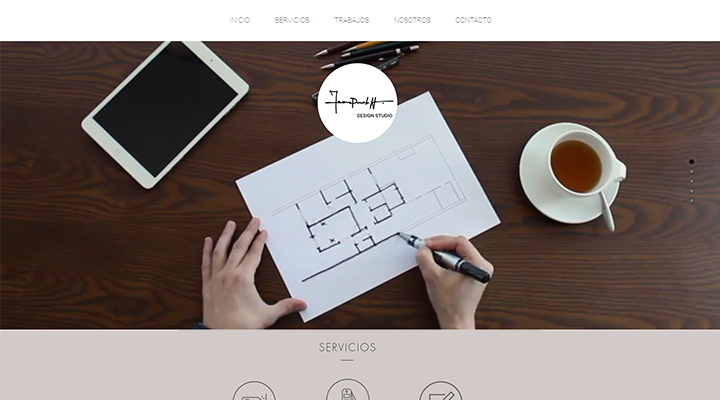
The next visually stimulating website is Leandro Pedretti. The header of the website features a full video illustrating the design skills of the company. One click and you’re impressed at once. Videos are quite potent. They try to evoke feeling. Much more than just pictures. And while you can, you reap the benefits of growing internet speeds. However, keep the text short and to the point, switching on auto-mute. It’s like in your space trying to find a fish.
Latest posts by Moiz Khan (see all)
- How to Use AI to Enhance your SEO Strategies? - August 31, 2023
- What You Need to Know About Test Automation in DevOps - August 30, 2023
- 6 Cloud Computing Challenges That Businesses Need to Be Aware of - August 22, 2023

 Careers


