Suffice to say that an efficient e-commerce web design is essential for getting more revenue on the website. It’s not always easy to run an e-commerce website. There are transactions to be made, orders to be filled, and payments to be received That’s why it’s necessary to make sure that your bases are covered whenever it comes to maintaining a well-rounded website.
Effective web design for e-commerce is integral to the conversion of website visitors into customers Preferably, the design of your website will make your purchasing process as simple, convenient and stress-free as possible. Regardless of how good your online marketing is, you might lose valuable customers if your website is not tailored for sales. Therefore, not only does the site need to look great, but you also have to get your website visitors to take action and buy your products. But how are you going to do that?
Here are the top tips for an effective e-commerce design for driving better conversions.

E-commerce websites with sleek design have greater conversion rates. Take a look at your website. Make sure there should be a clear focus. Visitor’s attention should be drawn directly to the CTA key or the products/services you offer. To further simplify the design of your website, eliminate all irrelevant information and use a minimalist design style with much white space.
Having to adapt the minimalist design to your website will allow you to significantly minimize uncertainty, keep user dissatisfaction at a low level and provide them what they came for.

Menu bars enable users to quickly access the pages of your site and find out what they’ve been looking for. This is just the best way to stay streamlined and share what you’re selling.
Too much menu-clutter may seem messy and overwhelming. Numerous menu categories will confuse the customer, keeping them from finding what they were looking for.
Your menus aren’t meant to be very precise. You can use broad terms to classify your products instead. If you have a lot of different categories and pages to offer on your website, you may use the drop-down menu to arrange them more simply instead of having a menu flooded with a long list of options.
Your e-commerce web design should always be designed to generate sales. It’s good to include additional details about your brand’s story, blog or even a choice to website visitors to register for an email newsletter. Just try to ensure that these little pieces of information shouldn’t interrupt people from making a purchase. One such type of interruption that affects any site is a screen-filling pop-up that asks to submit my email in return for a newsletter. Such a little mistake costs the particular e-commerce store a customer. For example, a form on your contact page or at the bottom of your website that people can fill out to add to your email list is all right. But don’t allow a pop-up window telling users to sign up for your newsletter as it may have the reverse effect of what you’d like.
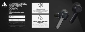
It is highly recommended to have a feed for your product. You must ensure that you have sufficient details about all of your products for product feed. Or at the very least, make absolutely sure you have your product name, high-quality image, product ID, keywords, and marketing copies, respectively.

Deciding the colors of your e-commerce webpage is one of the most crucial decisions. Color is an incredibly effective tool — but if you know the psychology behind color, you could use it for your benefit and push some great sales through the process.
Various colors can influence people’s different thoughts, attitudes, and actions so if you want your e-commerce page to convert, you must use those color inspirations to your benefit.
For instance, if you would like people to make a purchase, make the buy button pop out with a bright red color. And research shows that having a red button can boost conversions by a whopping 34%. Or, maybe, if you’re planning to increase your credibility, add blue to your web design. The idea is, colors are one of the most valuable tools in your design toolbox — and if you understand how to do it, it may have a massive impact on your e-commerce layout.

61% of online shoppers report reading customer reviews before they decide to purchase a product. While designing your e-commerce website, look for opportunities to give your potential customers the constructive feedback you’ve received from your loyal customers. Nobody can ignore the value of the website reviews and Testimonial area. As it helps ensure you design an efficient segment of your e-commerce web design. One of the best ideas is to add product-specific reviews to every page of your website to maximize the experience of site visitors.
When the people see and examine other people’s positive shopping experience on your website, be it through testimonials, ratings or reviews they will be convinced of shopping from your e-commerce store. This will lead to higher conversions.

A complicated checkout process is the biggest reason behind the cart abandonment rate. If a website visitor has decided to buy a product, they would want to check out and complete the process as simply as possible. Every additional step in the checkout process would increase their chances of losing the purchase. In fact, 28 percent of shoppers have said that they have abandoned a shopping cart at checkout because the procedure was too long and complex.
Enable people to check out as a guest. The objective is just to get the important information from the buyer. Customers get skeptical when they need to give too much information to make a purchase and having to make an entire profile on your website could turn them away faster. Simply, take the billing information and shipping address. That’s essentially you need to process a transaction.